
Short version: we’ve added official avalanche bulletins directly to the map.
Long version: now you can spend fewer minutes hopping between apps… and more minutes double-checking the plan (mountains like it that way).
A “smile” note: yes, we’re joking. Avalanches are serious business, and the goal of this feature is to make official data easier to consult—and harder to ignore.
Turn on the avalanche layer
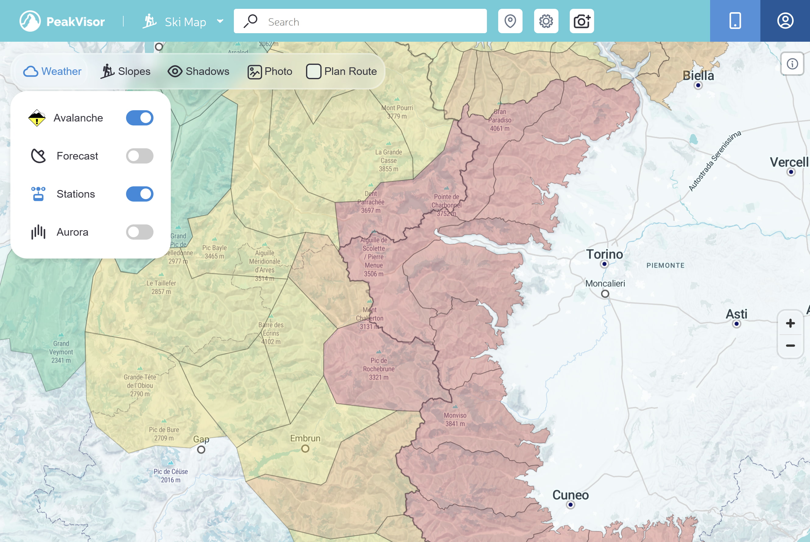
Open the Ski Touring Map, open the map menu (left panel), and enable Avalanche.
When it’s on, you’ll see:
- Danger icons in the center of each bulletin region
- Region coloring (danger overview)
- Clickable regions (tap/click to open the full official bulletin)
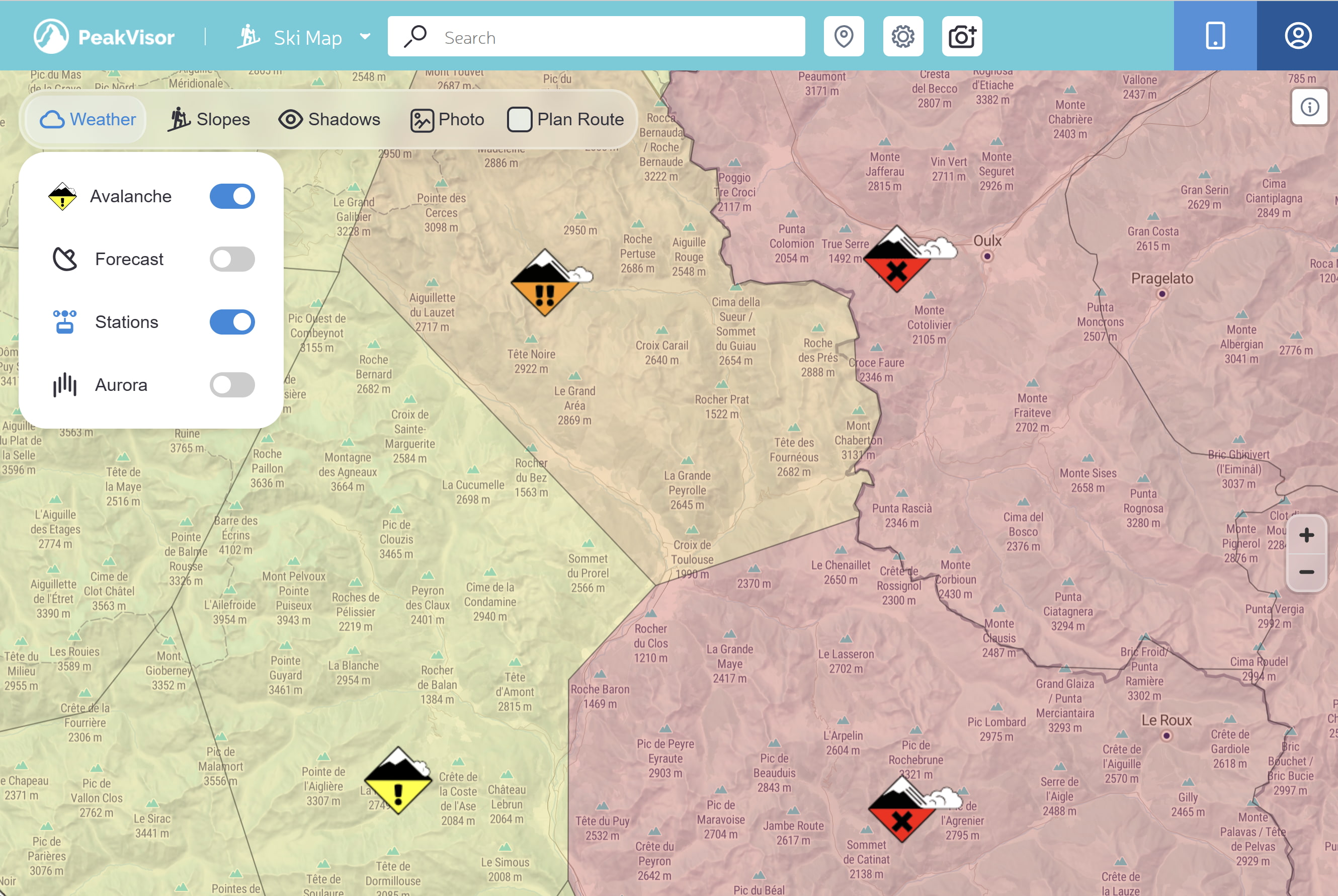
Reading the map: icons and colors
The layer communicates one thing immediately: regional avalanche danger.
Danger scale (overview)
PeakVisor uses the standard 5-level scale adopted by many agencies (EAWS-style). Terminology may vary from country to country, but the mapping is:
| Danger level (overview) | Map icon |
|---|---|
| 1 — Low (green) | |
| 2 — Moderate (yellow) | |
| 3 — Considerable (orange) | |
| 4 — High (red) | |
| 5 — Very high (purple) | |
| No rating / Unknown (gray) — treat it as missing information, not “safe”. |
Tap/click a region or an icon to open the full bulletin.
Quick summary in the sidebar
The avalanche layer is perfect for a big-picture overview, but decisions often revolve around a specific objective: your ski tour route, a summit, a pass, a hut, or another POI.
That’s why PeakVisor also shows a compact bulletin summary directly in the left sidebar when you open an object. If you need all the details, tap Open avalanche details.
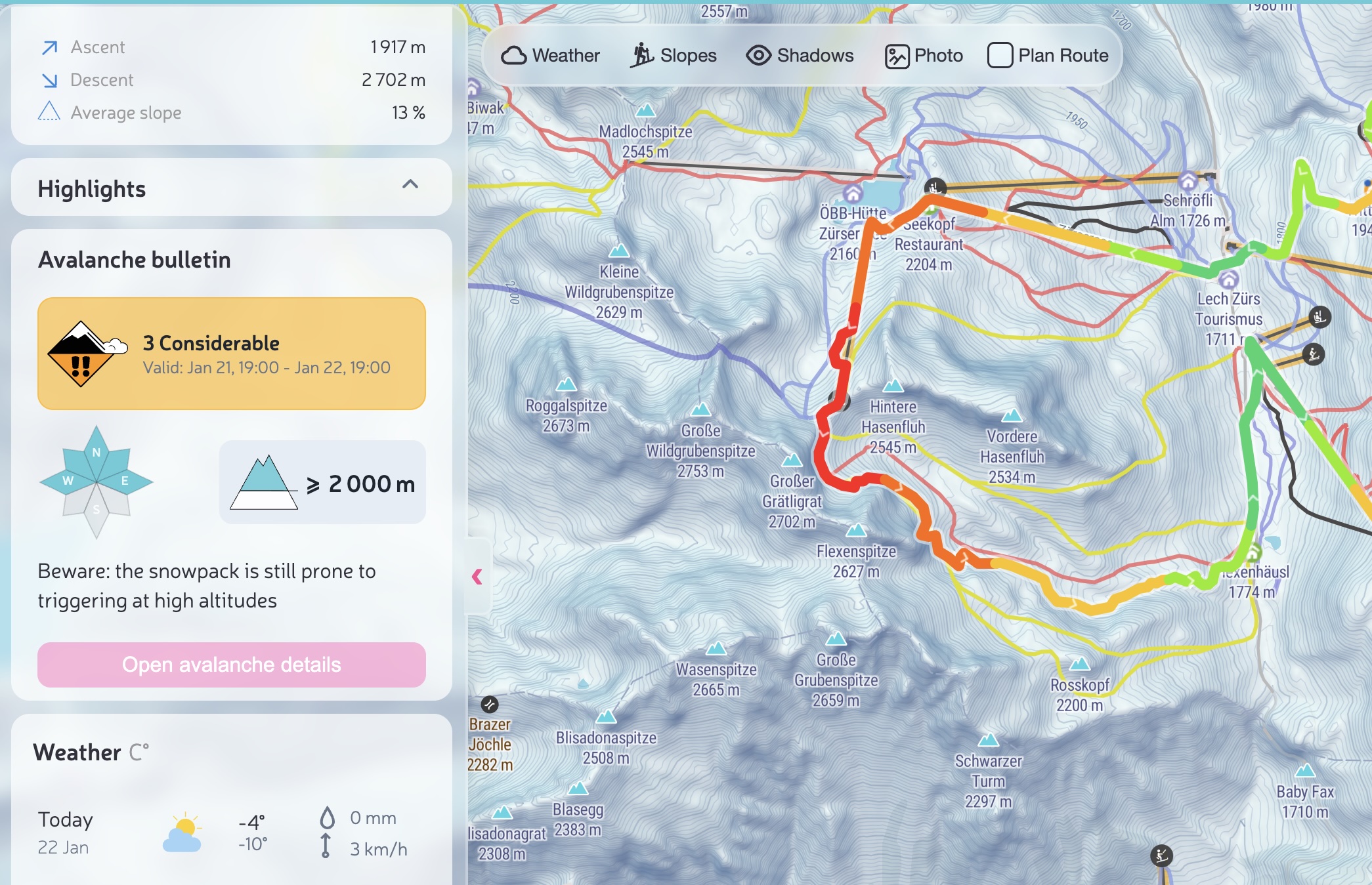
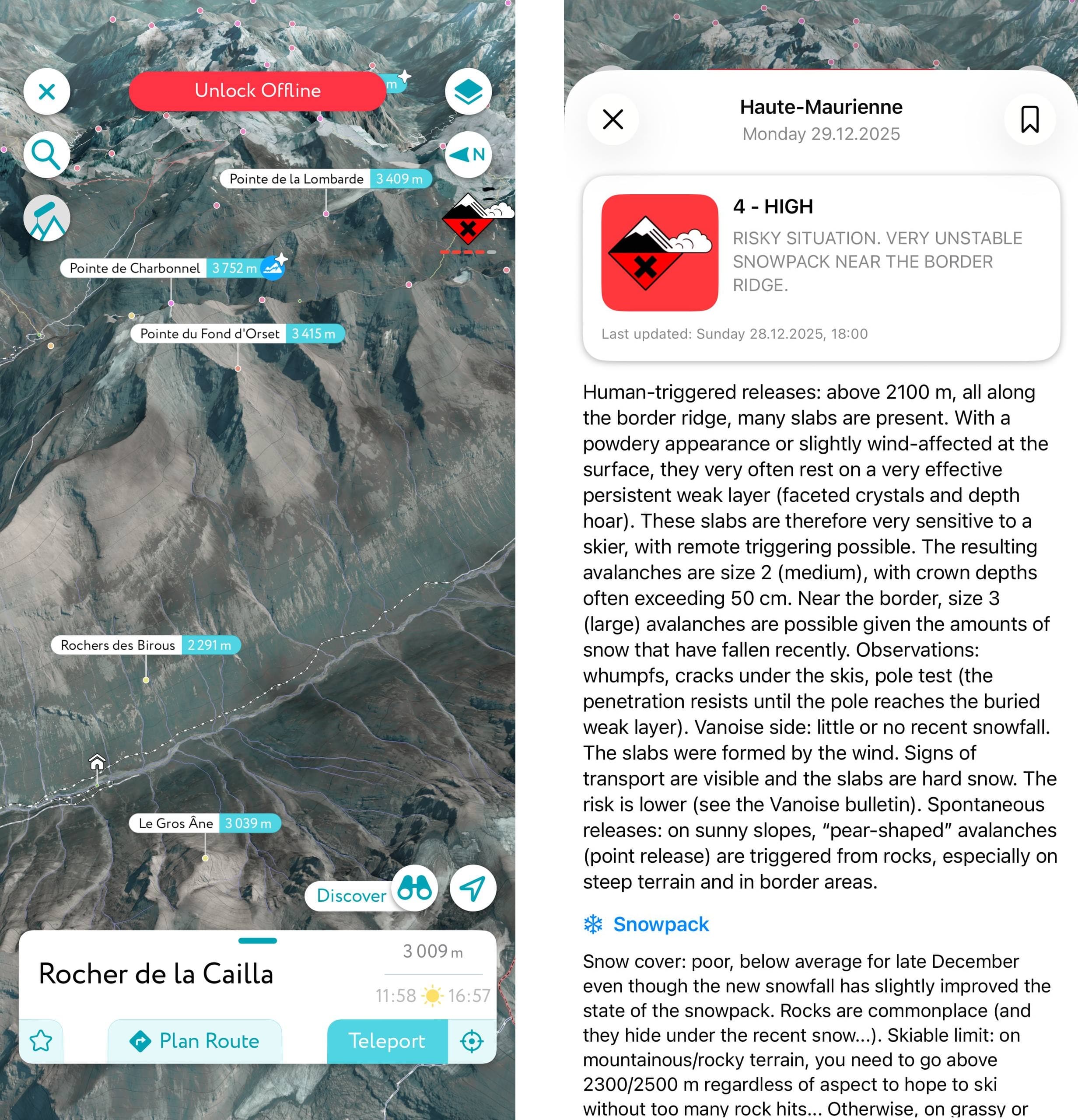
Open and read the full bulletin
The bulletin view is designed to quickly answer the three most important questions:
- How dangerous is it today? (overall danger)
- Where is it dangerous? (elevation bands + aspects)
- What’s the problem? (problem types + details)
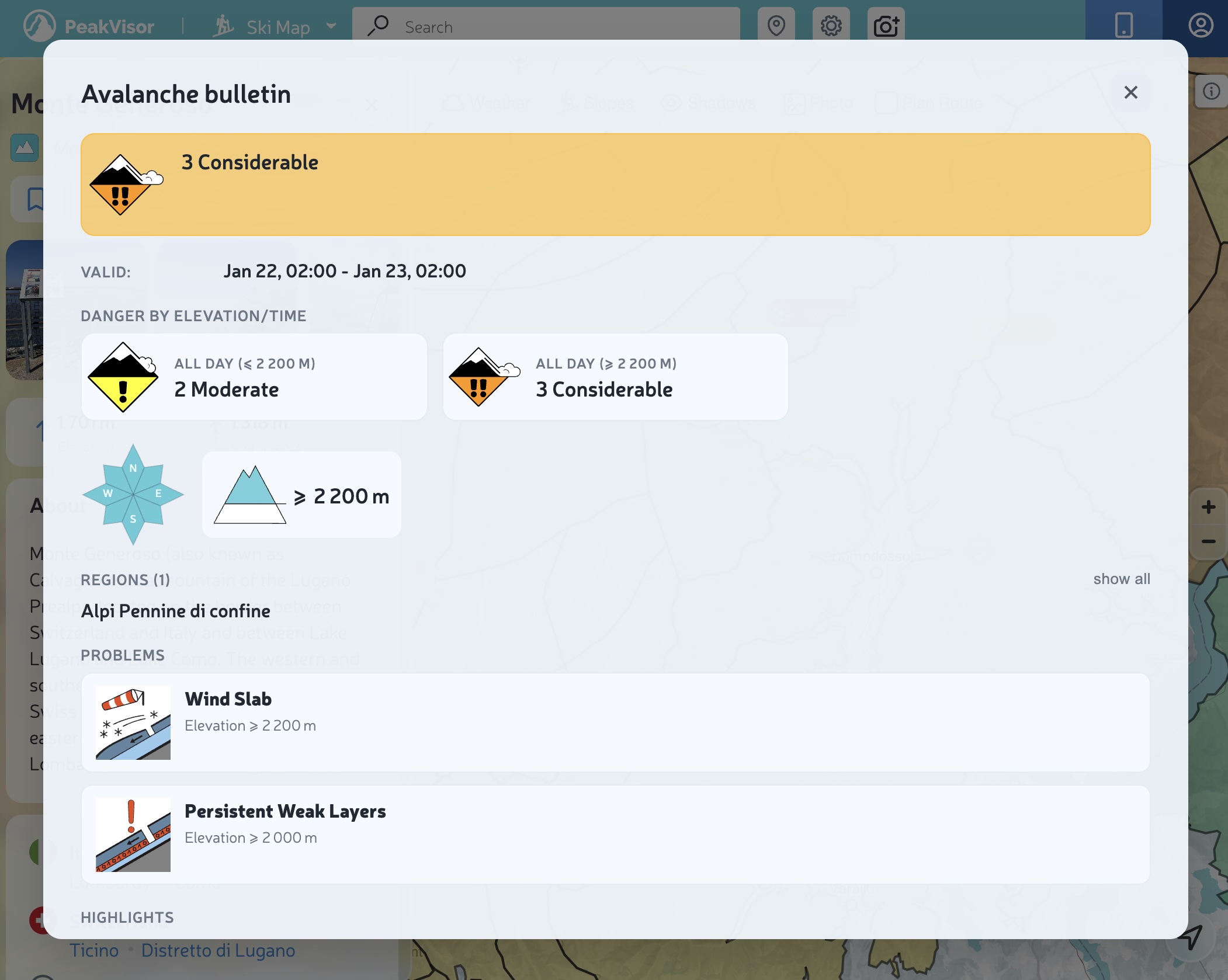
Validity
Always check the validity window. If you’re looking at the map late in the day, you might already be reading tomorrow’s bulletin (or yesterday’s, depending on the issuing agency and the time zone).
Danger by elevation / time of day
Many agencies split danger by elevation bands and sometimes by time of day. That’s why you may see multiple tiles like:
- All day (≤ 2400 m) — 1 Low
- All day (≥ 2400 m) — 2 Moderate
Interpretation: danger can change drastically above a certain elevation—and your terrain choices should adapt, too.
Aspects (the “compass”)
The small compass shows the slope aspects (N/E/S/W) where the problem is most relevant. Highlighted sectors = pay more attention on those aspects.
Problems
“Problems” explain the “why” behind the danger level: wind slabs, persistent weak layers, wet snow, etc. Here you’ll find practical guidance like typical trigger points, expected avalanche size, and behavioral advice.
Icon glossary (danger + problems)
Here’s a quick legend of the icons you’ll see most often.
Danger icons
(The same icons you see on the map.)
 1 Low: snowpack generally stable; watch out for isolated hazards.
 2 Moderate: some instability; route choice matters.
 3 Considerable: dangerous conditions on many slopes; more conservative terrain is recommended.
 4–5 High/Very high: travel in avalanche terrain is not recommended.
 No rating: missing/unknown data — treat it as “no information”, not “safe”.
Avalanche problem icons
 New snow: new snow hasn’t bonded well yet.
 Wind slabs: wind-loaded areas (often leeward) can be reactive.
 Persistent weak layers: they can surprise you; consequences can be severe.
 Wet snow: warming/rain can quickly increase danger.
 Gliding snow: hard to predict; avoid glide cracks and glide zones.
 No distinct problem: the bulletin does not identify a prevailing problem.
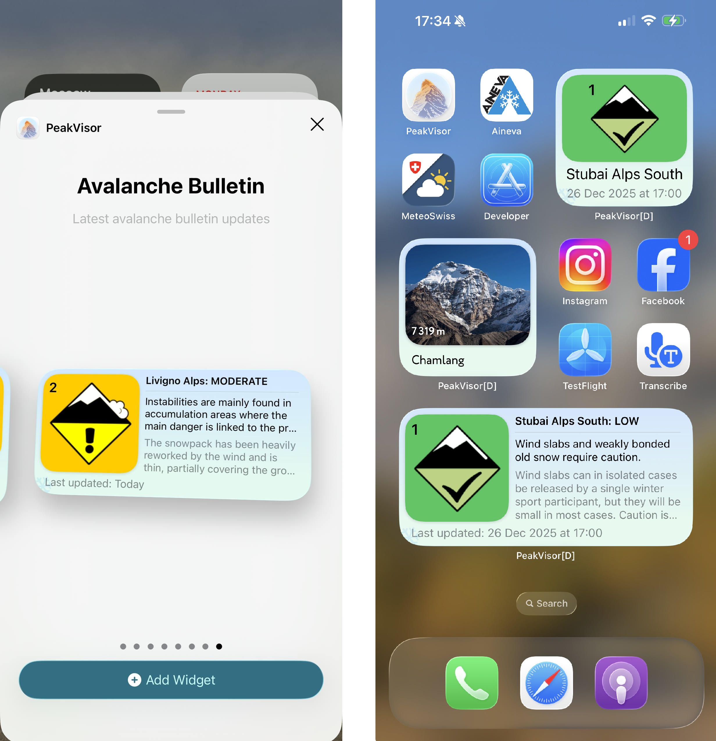
Mobile: quick access
On mobile, avalanche info is also available via widgets (depending on the operating system) and is always a tap away in the app.
Pro tip: deep link to a micro‑region
If you’re a guide, an avalanche forecaster, or you simply know your area code by heart, you can open the map directly on a specific bulletin region.
Examples:
- Show and zoom the avalanche layer on a region:
/ski-touring?avalanchebulletins=AT-02-02 - Automatically open the bulletin popup:
/ski-touring?avalanchebulletins=AT-02-02&info=1
This is a “power user” feature, meant for those who already know the region ID (codes like AT-02-02, CH-xx, etc.).
Safety note
Avalanche bulletins are one part of the decision-making process. They do not replace: training, on-the-ground observations, group management, terrain choice, or rescue preparedness.
If the bulletin and your gut disagree, listen to your gut. It usually gets fewer software updates.